
Brief
The STA logo is built on a triangular shape, symbolizing stability and balance—core values in the logistics sector. At
its center, the anchor represents trust, strength, and reliability, while the initials “STA” are seamlessly integrated
to create a distinctive and memorable identity.
The green gradient paired with wave-like lines reflects growth, movement, and progress, mirroring the constant flow of
transport and logistics. Together, these elements communicate professionalism, dependability, and a modern brand image
that stands strong in the industry.
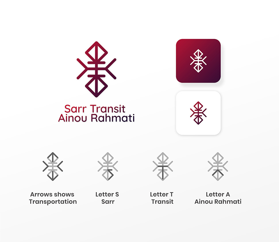
Sarr Transit
Ainou Rahmati
New brand identity
STA Transport & Logistics presents a brand identity that blends professionalism with clarity. The logo’s modern design captures the essence of seamless connectivity and dependable service. Its structured form reflects discipline, while the color palette conveys energy and forward motion. Together, the visual identity strengthens STA’s positioning as a trusted logistics partner, ensuring recognition across markets and mediums.
THROUGH AIR
The lines inside the triangle -denotes the first way of transportation
THROUGH AIR
The lines inside the triangle -denotes the first way of transportation
THROUGH AIR
The lines inside the triangle -denotes the first way of transportation


Colours

Web Design

Logo Trials
We explored multiple logo trials for STA Transport & Logistics, experimenting with shapes, symbols, and typography to capture trust, speed, and reliability before finalizing the design.