


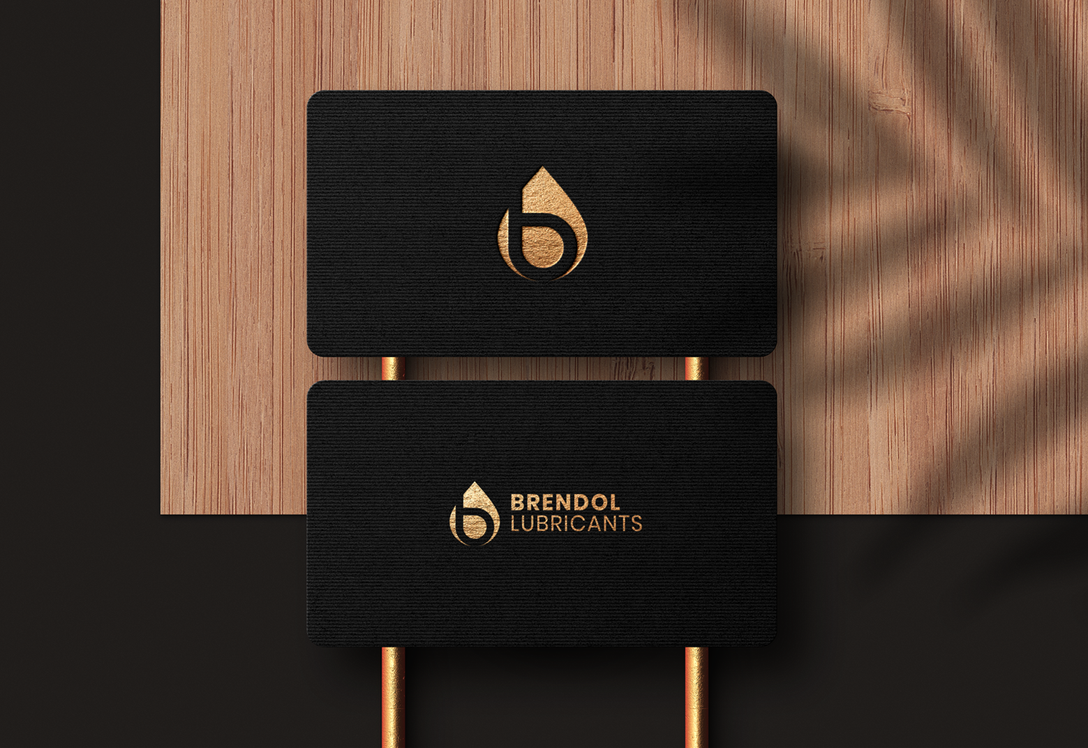
The Brendol Lubricants logo combines simplicity and symbolism to reflect the brand’s identity. The drop shape represents oil, directly connecting to the lubricant industry. Inside the drop, the stylized letter “b” stands for Brendol, creating a strong, memorable brand mark. The use of orange conveys energy, reliability, and innovation, while the black and white variations add versatility for different applications. This modern design highlights professionalism, trust, and product strength—making it both recognizable and impactful.

The Brendol logo is crafted to stand out with a minimal yet powerful identity. Its geometric balance and bold color choice convey durability, precision, and modernity, ensuring the brand leaves a strong impression across digital and print platforms.
